Table of Contents
Features And Basic Details
This plugin is a port of the venerable GNOME 2 Hardware Monitor to XFCE4 (originally written by Ole Laursen), so that I could get at a network bandwidth graph. It can display various system stats (CPU, filesystem and network usage among others) in graphs, visualisations or with text.
Original GNOME 2's applet page: This port has had a fair number of additions ontop of the GNOME 2 original code.
README: Requirements for running, important issues to be aware about.
ChangeLog: Detailed changes and important notices between the versions.
Debian archives: See also the special readme.
Officially packaged in distros (note my own Debian packages above, email me (OmegaPhil@startmail.com) if you know of more): Arch, Fedora
3rd party packages: CentOS7 (courtesy of Sal Tepedino): v1.6.0 x86-64, debug, spec file is included with the source in the 'centos' directory.
For those interested, here are build instructions from Sal:
'In addition to the build libraries (libglademm, etc) from the Nux Dextop repo, the configure line had to specify the library path that this xfce install prefers:
./configure –prefix=/usr –libdir=/usr/lib64/ (and of course make/make install)'
Source: Browsable git repo also with archives of tagged source for downloading specific releases (although presumably you'll get this through your package manager along with XFCE4 at some point).
I now have one tester, with a few confirmed users, so in general it seems to be going its job.
Temperature and fan speed monitors have not been tested by me, if people are willing to test this, please open a bug and I can look into it.
My day to day configuration and testing is based solely on a simple network bandwidth graph (I wanted something approaching NetMeter after I graduated from Windows long ago).
I welcome and am happy to fight bug reports here.
Feature Detail
The plugin supports various viewers which you can switch between easily (all are animated smoothly, all bar the textual view have an optional text value overlay):
- A graphical view where each monitor is represented by a (time, measurement) colored curve
- A bar-plot view with a horizontal or vertical bar per monitor
- A column view with a column (time, measurement) diagram for each monitor
- A textual view which simply lists the monitors and the currently measured values
- A flame view which produces spiffy flames, the sizes of which are determined by the values of the monitored device
And the plugin supports monitoring the following hardware characteristics:
- CPU usage (all CPUs, or one at the time) - low-priority background processes such as SETI@home are automatically ignored
- Memory usage - cache and buffers are automatically ignored
- Swap usage
- Load average
- Disk usage (or disk space free)
- Disk statistics (anything from '/proc/diskstats', from v1.6 sectors read/written has been replaced with bytes read/written to report on actual I/O speeds)
- Network throughput (Ethernet, wireless, modem, serial link), either incoming or outgoing or both
- Temperatures from internal sensors (e.g. system board and CPU temperatures)
- Fan speeds from internal sensors
- Any number that can be read straight or via a regex from a file via the Generic Monitor
To avoid eating CPU time when it is scarce, the plugin lowers its priority.
Configuration
Addition
Firstly, add the Hardware Monitor plugin to a panel by right-clicking on the panel → Add New Items… → locating the plugin in the available selection:
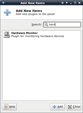
By default you end up with an 'All processors' CPU monitor with the curve visualisation in the panel:

Configuration Of The Device You Are Monitoring
Right-click anywhere on the visualisation → Properties brings you to the Hardware Monitor Preferences dialog, and the Devices tab. Here you can add, remove and change 'devices' (monitors/data sources) that will be displayed together in the visualisation (to have more than one visualisation in a panel, add additional plugin instances).
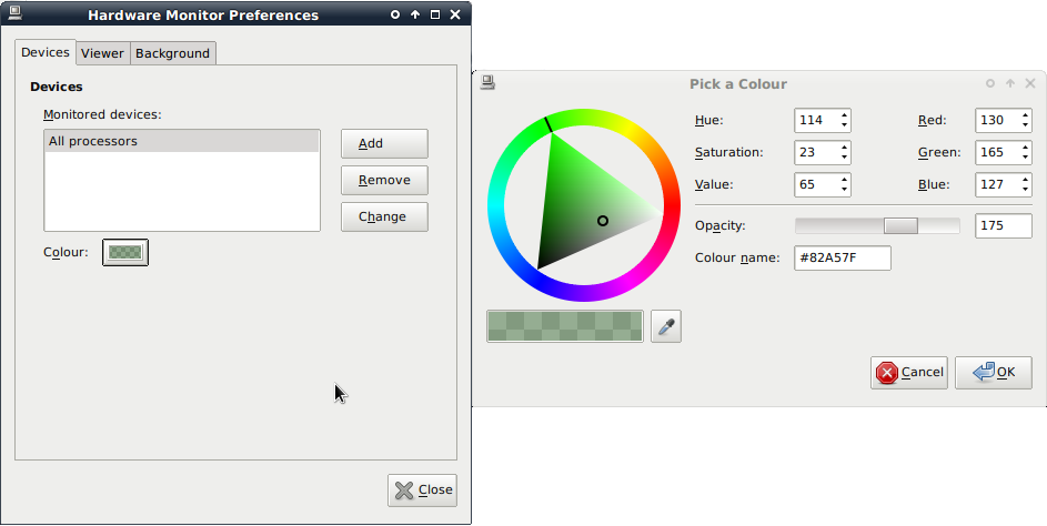
In this example, the colour button has been pressed (see underneath the devices list) and the GTK colour picker dialog has appeared. Here you can set the precise colour for the selected device in the list's data to appear as in the visualisation (applies immediately).
Remove the current monitored device and press the Add button:
System Tab
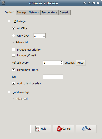
CPU Usage
Here you see the System tab, showing the default 'All CPUs' CPU usage monitor to add. You can also pick an individual CPU here, then add more and more 'devices' to track other CPUs if desired.
The 'Advanced' section has been expanded, here you can choose to include or exclude CPU usage associated with low priority processes (nice'd below the standard priority), or CPU time spent waiting for I/O to complete (reading/writing to disks etc).
'Refresh every x seconds' allows you to control how often the monitor updates, with once per second being the most frequent update speed (and the default for this monitor - reset allows you to restore the default rate). This is mainly useful when you have different monitor types displaying on the same visualisation, by default with different update rates - if you want them to all update in sync, configure the same refresh rate here.
'Fixed max' allows you to control how time-based visualisations (Curves, Columns, anything with a 'history') scale the maximum value they can display - e.g. for CPU usage, we are used to 100% being 'fully used', and the full 'capacity' of the CPU being on display at all times (so 10% usage means a line or block chart 10% up, etc). This is on by default for this monitor - untick to have the maxima scale based on the maximum value in the data being visualised currently (so if CPU usage only reached 10% while the plugin was monitoring, 10% would be the top of the Curve view e.g.). For time-based visualisations, the monitor data/values displayed across the width of the visualisation represent the snapshot/history of the monitor and where the maximum is taken from - once values pop off the left end, they are discarded (so the max doesn't decay over time from some stored peak, it is literally the maximum visible in the visualisation right now).
Where non-time-based visualisations are used (e.g. Bars, Flames), this monitor always uses a fixed max of 100%. If you would like the max to be configurable in this case, please make a feature request.
'Tags' are short descriptive words intended to be displayed along with the relevant device data in the optional text overlay for all visualisations bar the Text visualisation (this allows you to quickly identify individual monitor values amongst a string of potentially many numbers). If 'Add to text overlay' is unticked, the monitor will not be included in the text overlay.
Load Average
Load average is the current system load.
Please see CPU Usage for general discussion of the Advanced section - for this monitor, without a fixed max, in time-based visualisations (Curves, Columns etc) the displayed data max is used as the max, in other visualisations (e.g. Bars) the max value the monitor has observed since it has started is stored and slowly decays over time (10% reduction over 105 measurements according to an old comment).
Setting a custom fixed max here allows the user to pin the top/max of the visualisation to whatever value they want, and is the first monitor where this is sensible to do so.
Storage Tab
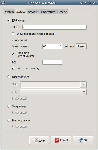
Disk Usage
With the Disk usage monitor, paste/type the path of a directory on the filesystem you want to see the used space for, using the 'Show free space' checkbox to report on free space instead.
For a general discussion of the Advanced section, please see the CPU Usage monitor above. For this monitor, 'fixed max' only refers to time-based visualisations (Curves, Columns etc), for others the size of the relevant volume is always used.
Disk Statistics
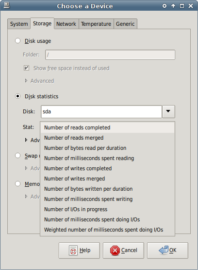
Disk statistics reports on all disk/device stats available from '/proc/diskstats' - note that the raw numbers aren't reported (that would just result in very large ever-increasing numbers over time), but the rate of increase per monitor duration (by default every second), with the exception of 'Number of I/Os in progress'.
Since v1.6, the number of sectors read/written has been replaced with number of bytes read/written in order to get at read/write speeds - if you want access to the original stats, please make a feature request.
For a general discussion of the Advanced section, please see the CPU Usage monitor above. For this monitor, without a fixed max, in time-based visualisations (Curves, Columns etc) the displayed data max is used as the max, in other visualisations (e.g. Bars) the max value the monitor has observed since it has started is stored and slowly decays over time (10% reduction over 105 measurements according to an old comment).
Swap Usage
Swap usage reports on the amount of swap space used.
For a general discussion of the Advanced section, please see the CPU Usage monitor above. For this monitor, 'fixed max' only refers to time-based visualisations (Curves, Columns etc), for others the size of total available swap is always used.
Memory Usage
Memory usage reports on the amount of RAM used (minus buffers).
For a general discussion of the Advanced section, please see the CPU Usage monitor above. For this monitor, 'fixed max' only refers to time-based visualisations (Curves, Columns etc), for others the size of installed memory is always used.
Network Tab
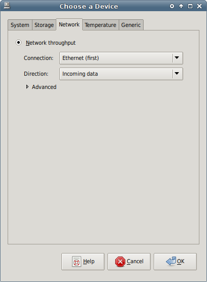
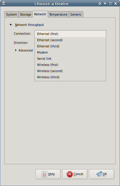
By default the first ethernet connection is selected, with the 'All data' direction reporting the sum of data transferred into and out of the interface. The second screenshot displays the various interface 'types' this plugin supports.
Direction allows you to report on the sum of all traffic, or just in one particular direction.
If you expand the Advanced section:
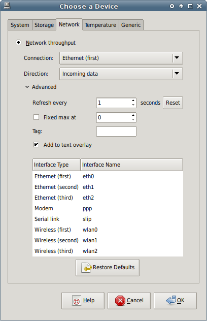
For a general discussion, please see the CPU Usage monitor above. For this monitor, without a fixed max, in time-based visualisations (Curves, Columns etc) the displayed data max is used as the max, in other visualisations (e.g. Bars) the max value the monitor has observed since it has started is stored and slowly decays over time (10% reduction over 105 measurements according to an old comment).
The Interface Type/Name configuration is a major new feature for v1.4.7 - actual interface names are no longer hardcoded based on their 'type' (e.g. 'Ethernet (first)' was always 'eth0') - you can now enter whatever you want in for each interface name, again with the intention that the interface will be available later if it isn't currently (you will get a warning if the interface isn't detected to make sure you want to go ahead anyway). Along with dealing with examples of many instances of a particular type of interface, this also allows supporting distros that have started to break away from UNIX traditional interface naming.
As an extreme example, with this functionality you could configure 8 wireless interfaces if you wanted, albeit with the wrong interface type names displayed (to get at more, use more than one instance of the Hardware Monitor plugin - configuration is separate).
To edit an interface name, single-click the name and enter - note that this change applies immediately to all network monitors associated with the current plugin instance. Use the 'Restore Defaults' button to return to the original configuration.
Temperature Tab
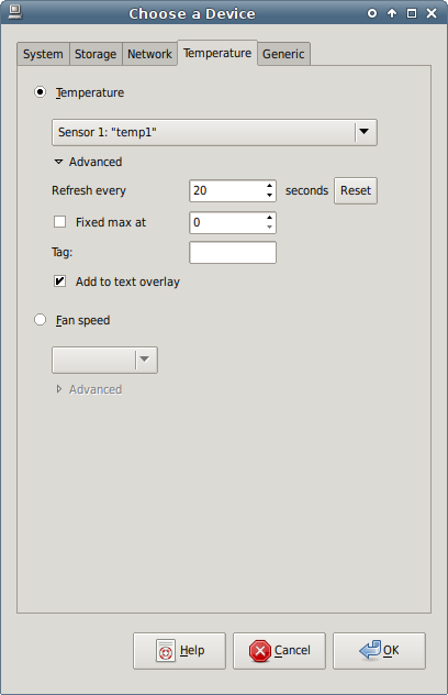
These montiors are not used by me and have not been tested. If you want to see this functionality work and are willing to test, as mentioned earlier please raise a bug and I'll see what I can do.
Generic Tab
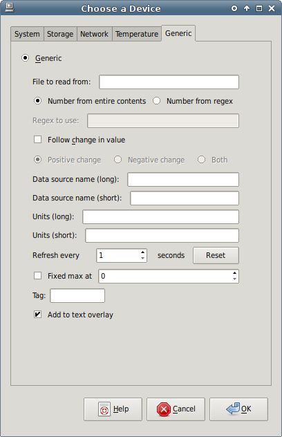
The Generic Monitor is an advanced monitor to allow power users to effectively visualise/plot any data source they want, if they can turn it into a number and put it in a plain text file (in true UNIX fashion). The intention is for the user to regularly output data (via a script) to a file (optionally on a RAM filesystem to avoid pointless I/O on a real device, e.g. under '/run/shm' on Devuan), and this monitor read the single value and plot.
Keep in mind that:
- The visualisation/graph area available is rather small
- Positive axes available only
- The y axis is a complete scale (aside from the 'fixed max at' setting near the bottom) - so plotting very large numbers that change little will be a bit pointless as the line will be stuck at the top of the graphing area and will apparently not change
If enough people are interested, I can extend how the values are processed (e.g. values passed through a basic calculation like '* 10', '/ 1000' etc) to make it a bit more flexible, please make a feature request.
For basic usage, you would specify a file which contains a single line with just a number (including the the usual newline at the end) - this is 'Number from entire contents'.
When the source file isn't tailored for the monitor, superfluous text will be present, so you'll need to use a regex to extract the number with a capture group (tutorial site) - the Perl Compatible Regular Expressions engine is used, for detailed information see 'Detailed Description' in the glibmm documentation (which is at version 2.48.1 at the time of writing, you may need to edit the URL for later versions).
Select the 'Number from regex' radio button, and put the regex in 'Regex to use'.
Usually the first line of contents are extracted from, with the rest ignored - so as a basic (and pointless) example, the following is intended to extract the first device's major number from '/proc/diskstats':
[[:space:]]+([[:digit:]]+).*
If you are following a number that doesn't change much (worse still, a large number), rather than plotting it raw, you might be interested in the 'Follow change in value' option - you can then plot how the value changes over time, i.e. the difference between the current value and the one recorded on the last check.
Since the visualisation/graph area only implements a positive y axis, plotting of change is a bit limited - 'Positive change' will plot the value of the change only when a number goes up, 'Negative change' when it goes down, and 'Both' will basically plot the absolute change in value whether it goes up or down.
For example, with Positive/negative change, the following will happen:
| Measured Value | Previous Value | Change | Plotted Result - Positive | Plotted Result - Negative |
|---|---|---|---|---|
| 2 | 0 | +2 | 2 | 0 |
| 2 | 2 | 0 | 0 | 0 |
| 1 | 2 | -1 | 0 | 1 |
| 4 | 1 | +3 | 3 | 0 |
and equivalent for 'Both' etc.
'Data source name (long)' is used for the name of the Monitor, and the short version is used for the tooltip etc.
Units are optional and are appended to the reported value in the usual places.
For a general discussion of the remaining advanced settings, please see the CPU Usage monitor above. For this monitor, without a fixed max, in time-based visualisations (Curves, Columns etc) the displayed data max is used as the max, in other visualisations (e.g. Bars) the max value the monitor has observed since it has started is stored and slowly decays over time (10% reduction over 105 measurements according to an old comment).
Changing A Monitor
Back on the Devices tab of the Preferences dialog, the Change button allows you to change an already-present monitor using the 'Choose a Device' dialog previously discussed. Most changes require pressing OK to submit, the exception is the Network monitor advanced interface name mapping which updates immediately as mentioned earlier.
Visualisations/Views
Monitor data is collected together and displayed in a visualisation - this is configured in the Hardware Monitor Preferences dialog, Viewer tab.
Any changes you make on this tab apply and are saved immediately (in the case of text entries, when the entry loses focus).
Curve View
The following shows an example of the Curve view (selected under Viewer):

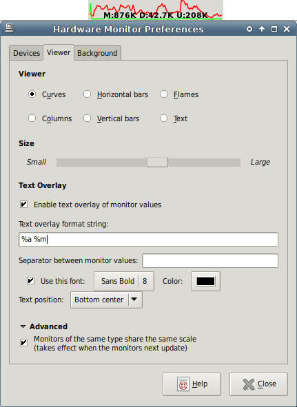
The example displays two curves, incoming and outgoing data on my main ethernet interface, along with a text overlay reporting the graph maximum and the actual values from the monitors.
The curve visualisation/graph scales depending on how the included monitors are configured (see discussion on the monitors' advanced settings) - the simplest case is either:
One monitor with fixed max: Scale is fixed with the top of the view representing the monitor's maximum value, either hardcoded as appropriate for the monitor type, or a custom value configured by the user.
One monitor with non-fixed max: Scale changes in realtime to keep the maximum value visible/unclipped from the monitor history, which corresponds to the length of the visualisation.
By default 'Monitors of the same type share the same scale' in the Advanced section is enabled (see at the bottom), for example above the two lines represent two Network monitors and therefore they are both working to the same scale - if two Disk Usage monitors were added, these two monitors would share their own scale, but would be independent of the scale of the original Network monitors. That is, the Network monitor maxes/scale would not affect the Disk Usage monitor maxes/scale, and vice versa - so you effectively have two separate Curve groups on the same visualisation. With this, you can include as many monitor types on the same visualisation as you like, with sensible scales in use.
If you would rather all monitors share the same scale (even if the units are incompatible), untick this option.
Note user-customisable monitor update rates in the Advanced sections of individual monitor configuration - by default different monitor types update once a second, 10 seconds, 20, 1 minute etc - but can be configured to update at any rate (fastest is 1 second), which can be used to keep monitors of different types in sync, or include 'slow' and 'fast' monitors on the same visualisation etc.
The size control allows you to shorten or lengthen the width of the visualisation.
When you enable the text overlay, you can get at the maximum value of the graph (the units of which are taken from the first monitor displayed), along with a summary of reported values from the contained monitors along with their associated tags (so you can tell where the particular values come from) - the precise text is configurable by you in the format string:
%M: Monitor values (full)


%m: Monitor values (compact - no spaces, shorter units)


%A: Graph max (full)


%a: Graph max (compact - no spaces, shorter units)
If the visualisation contains monitors of different types, the output text is duplicated per monitor type with maxima reported appropriately (as an exception, if your chosen text contains no substitution variables, it will be outputted once regardless of how many different monitor types are included in the visualisation. This allows for an overlay text label rather than the usual monitor value reporting). As the output can get long quickly, there is a compact mode, the difference is demonstrated in the above screenshots.
In individual monitor Advanced configuration, you can disable inclusion in the text overlay.
It isn't obvious, but the configured monitor value separator is a single space - in the full mode, this string is used to separate values from tags, and between separate monitor outputs, and in the compact mode tags are right up against values so it just affects the output between monitors.
The font used is fully configurable via the usual GTK font picker, colour works as with the previous colour picker - unfortunately the output text can only be in a single colour currently.
Text position allows you to place the text as desired:
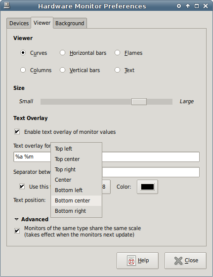
The example uses the 'Bottom center' option.
Horizontal Bars View
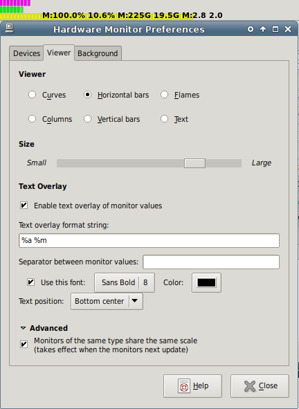
Configuration works in the same way as the Curve View.
Flames View
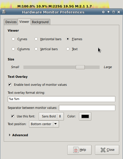
Configuration works in the same way as the Curve View.
Columns View
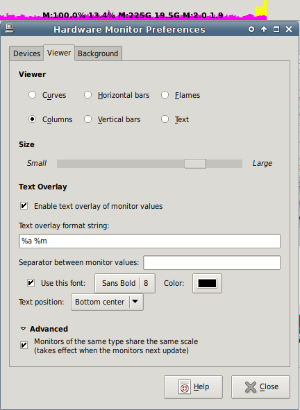
Configuration works in the same way as the Curve View.
Vertical Bars View
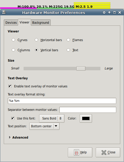
Configuration works in the same way as the Curve View.
Text View
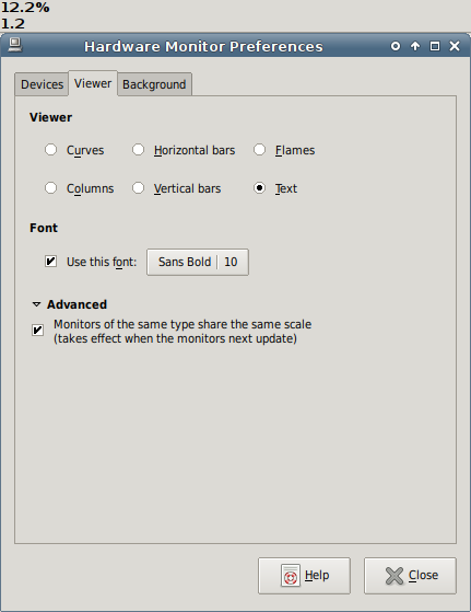
In this view you can configure the font via a GTK font picker in the usual manner, see Curve View for discussion of the Advanced section.
Background
Finally, the Background tab:
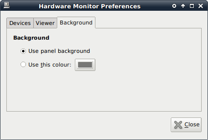
The normal panel background or a user-defined colour can be provided via the usual GTK colour picker.
Screenshots
The following is reproduced from the original applet screenshots page:
A screenshot of all views monitoring CPU and network usage:

To the left the curve viewer (all-round), then the bar viewer (best for disk/memory usage actually), then the cool flame viewer (for l33tn3z effect) and finally the text viewer. The five instances were made by adding the plugin four times to the panel - of course, in the normal case you would only have one or two instances running. No matter what, only one process is actually running, though, so it will not eat too many resources.
The flame effect is really best seen real-time - however, here's how it looks like when you let it monitor an Ethernet card (pink) and the CPU usage (blue). Notice the small sparks.


To the right a program's being compiled.
Adding a new monitor in another setup:
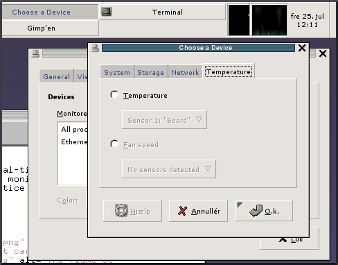
The devices preferences:
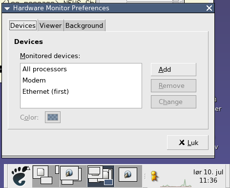
In general, the plugin tries to figure out the best setup itself so that you don't have to waste time configuring everything. This makes it possible to reduce the UI clutter, and it is also more challenging and fun to program (OmegaPhil: original author's words, not mine :p).
A nice screenshot from Ian Langworth:

Starting at left: sensors (CPU, motherboard, CPU fan), disk, CPU usage, net receiving, net transmitting. The rx/tx is from Gnome Network Monitor.
If you have a more interesting or exciting setup, please send a screenshot to me (OmegaPhil@startmail.com) so that it may end up here in the hall of fame.